

CSS Grid Layout
“allows authors to easily define complex, responsive 2-dimensional layouts”
by Tab Atkins Jr. (Google)
at CSS WG Blog
CSS Grid Layout | Introduction
- In the past people abused the usage of tables to implement grid based designs.
- Alternatives to tables were not easy to use. Problem of floating divs.
- Lots of CSS frameworks are emerging to ease the development.
- CSS Grid Layout is a powerful and flexible mechanism defined by the W3C.
CSS Grid Layout | Introduction
- CSS Grid Layout provides a mechanism to divide the available space in rows and columns with a set of predictable sizing behaviors.
- This defines a set of grid areas where designers can precisely place the elements of a web page.
- The Grid Layout spec can be used to intelligently reflow elements within a web page optimizing locations and sizes depending on the device where the page is rendered in.
CSS Grid Layout | Concepts
- Grid lines are the horizontal and vertical dividing lines of the grid.
- Grid track is a generic term for a grid column or grid row.
- Grid cell is the space between two adjacent row and two adjacent column grid lines.
- Grid area is the logical space used to lay out one or more grid items. It is bound by four grid lines, one on each side of the grid area.
CSS Grid Layout | Syntax
      .grid {
          display: grid;
          grid-template-columns: 200px 1fr;
          grid-template-rows: 100px 1fr auto;
      }

      .title  { grid-column: 1; grid-row: 1;          }
      .menu   { grid-column: 1; grid-row: 2 / span 2; }
      .main   { grid-column: 2; grid-row: 1 / span 2; }
      .footer { grid-column: 2; grid-row: 3;          }
display: grid: Defines a grid container.grid-template-columnsandgrid-template-rows: Specify the track breadths.grid-columnandgrid-row: Determine a grid item's size and location within the grid.
      <div class="grid">
          <div class="title">Title</div>
          <div class="menu">Menu</div>
          <div class="main">Main</div>
          <div class="footer">Footer</div>
      </div>
CSS Grid Layout | Syntax
      .grid {
          display: grid;
          grid-template-areas: "title  title  title  social"
                               "menu   main   main   social"
                               "menu   main   main   social"
                               "footer footer footer footer";
      }
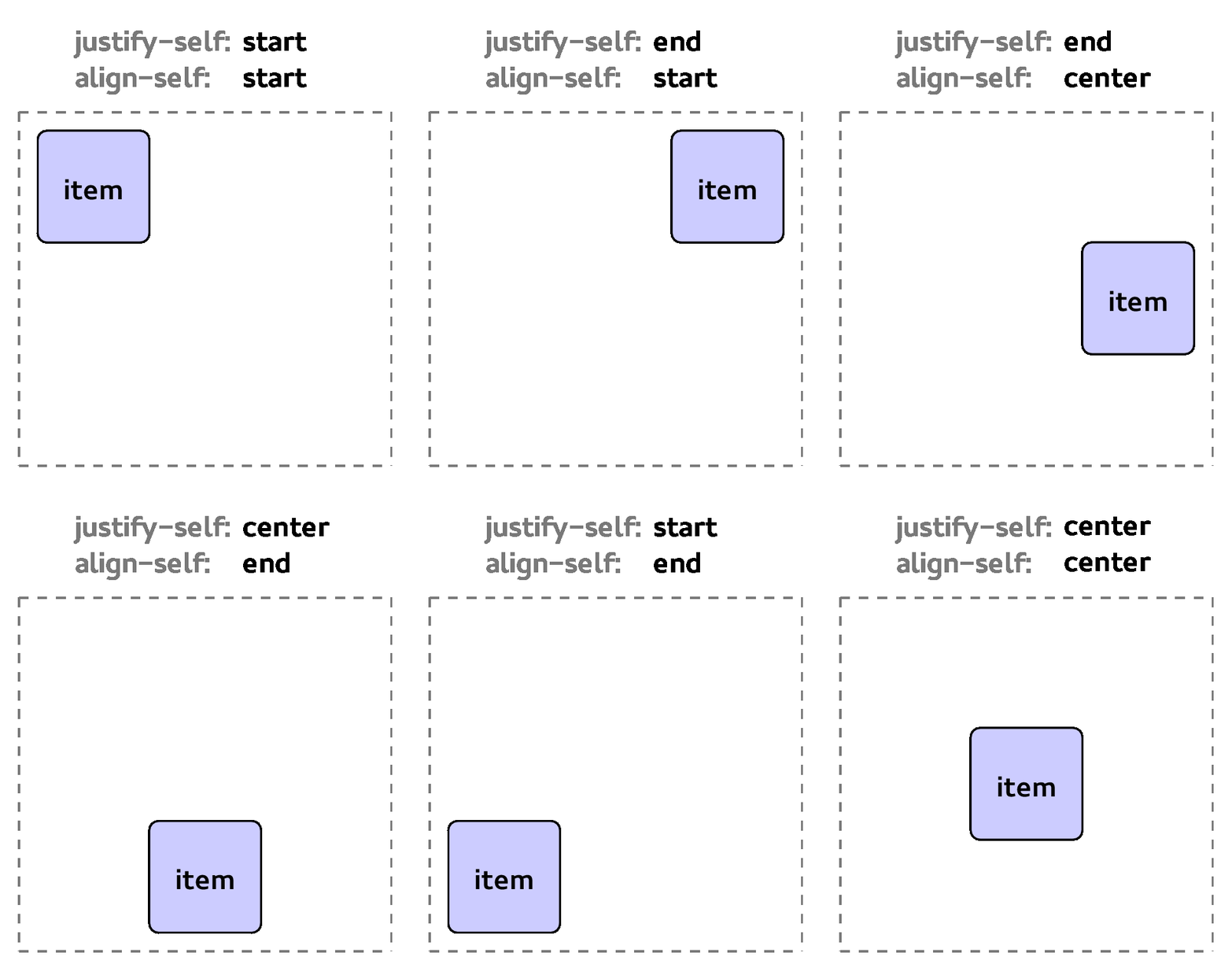
      .title  { grid-area: title; align-self: center; justify-self: center; }
      .menu   { grid-area: menu;  align-self: start;                        }
      .main   { grid-area: main;                                            }
      .social { grid-area: social; align-self: end;   justify-self: right;  }
      .footer { grid-area: footer; align-self: start;                       }
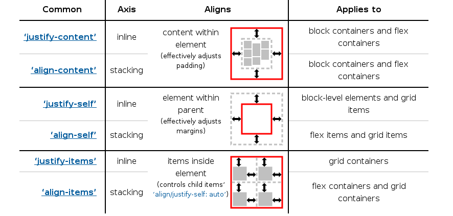
grid-template-areasspecifies named grid areas that can be referenced to position grid items.- Follows CSS Box Alignment spec for alignment features.
CSS Grid Layout | Box Alignment Properties
CSS Grid Layout | Self Alignment
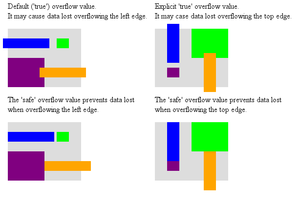
CSS Grid Layout | Self Alignment Overflow
CSS Grid Layout | Content Alignment
CSS Grid Layout | Content Alignment Overflow
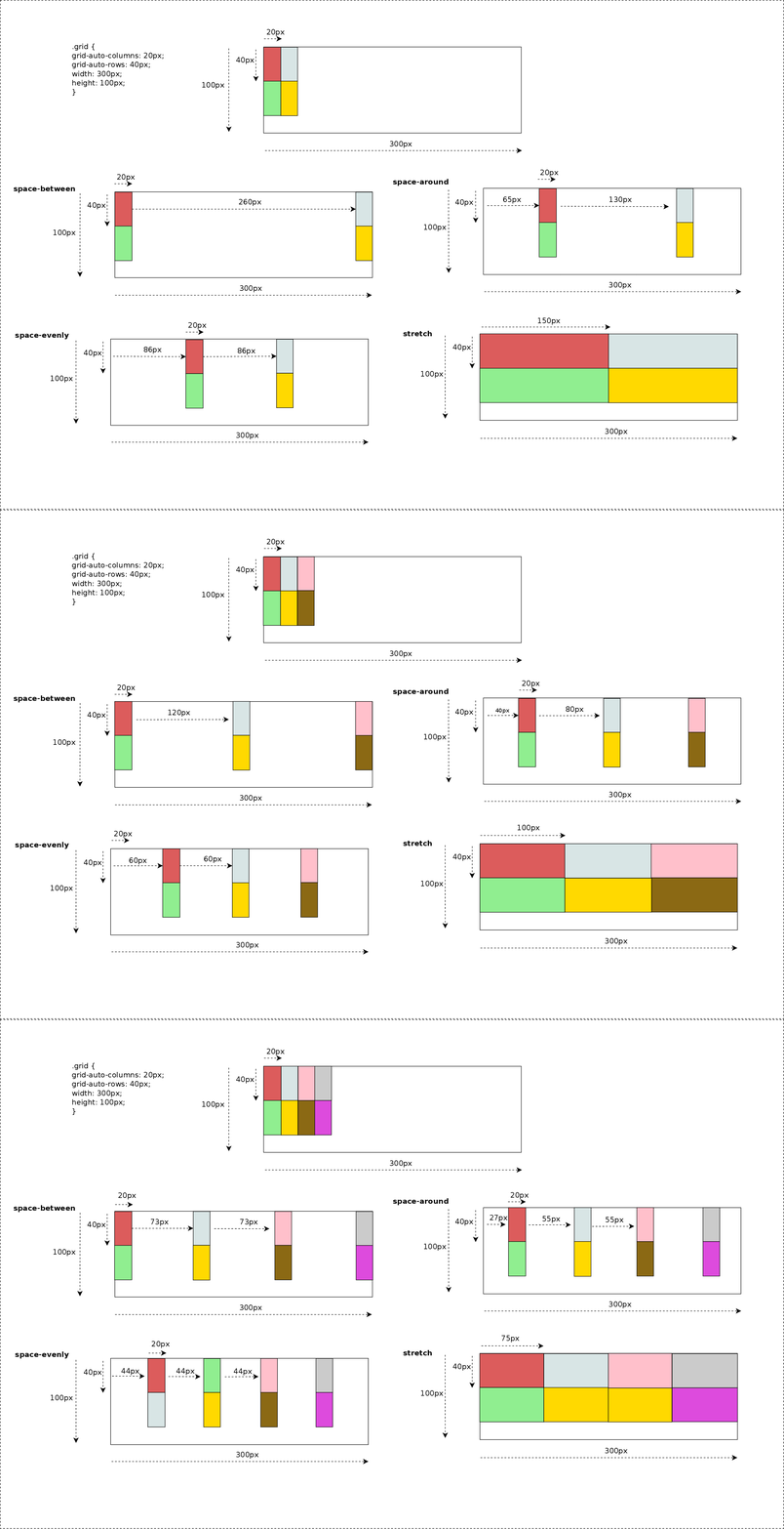
CSS Grid Layout | Content Distribution
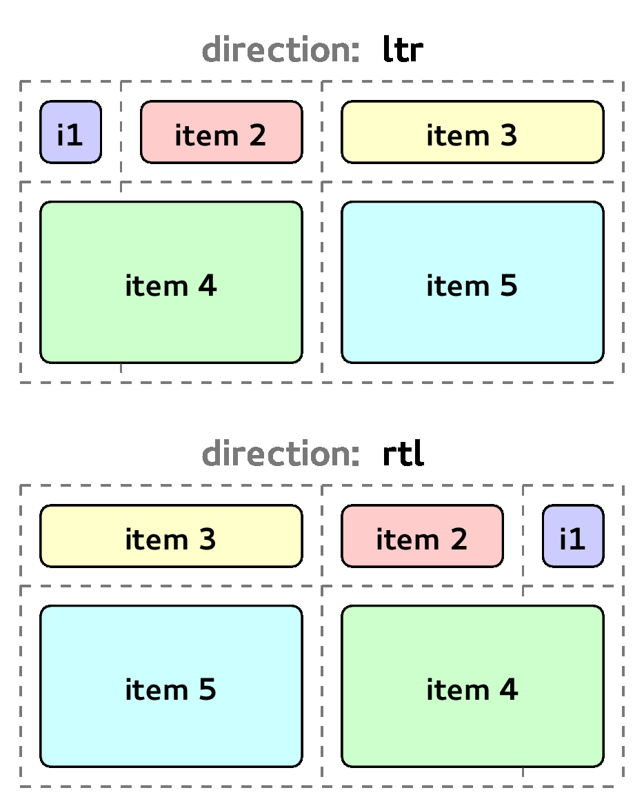
CSS Grid Layout | Writing Modes support
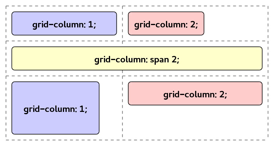
CSS Grid Layout | Auto-placement - span
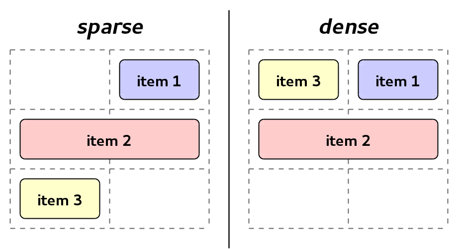
CSS Grid Layout | Auto-placement - sparse vs dense
CSS Grid Layout | Current status
- Spec (W3C Working Draft, 13 May 2014): http://www.w3.org/TR/css-grid-1/.
- Main browsers:
- Already shipped in IE/Trident.
- Work in progress in Chromium/Blink (Google and Igalia) and Safari/WebKit (Igalia).
- Firefox/Gecko has made some progress in the last year.
CSS Grid Layout | Status - Done
- Track Sizing Algorithm (http://wkb.ug/60731).
- Auto-placement (http://wkb.ug/103316)
- Alignment & justification (http://wkb.ug/133224 & http://wkb.ug/133222)
- Testing:
- Improve test coverage, which lead to some bug reports and fixes.
- Started to create the W3C test suite for grid
- http://test.csswg.org/shepherd/search/spec/css-grid-1/
CSS Grid Layout | Status - In Progress
- Track Sizing Algorithm (http://wkb.ug/60731).
- Alignment & Justification
- CSS3 upgrade of Box Alignment properties.
- Performance analisis and optimizations.
- Continue working on the W3C test suite in order to cover the whole spec. Then, import the test suite into WebKit.
CSS Grid Layout | Status - Future
- Absolutely positioned grid children.
- Alignment & Justification
- Completing the row-axis and column-axis alignment support for Grid Layout.
- Implementing the Content Distribution logic.
- Writing modes
- Adapting the track sizing and item positioning to any writing mode and direction.
- Handling grid's and item's margin, border and padding in different writing modes and directions.
- Support for orthogonal writing modes.
CSS Grid Layout | Status - Future
- Support 'auto' keyword for repeat() function.
- Continue working on the W3C test suite in order to cover the whole spec. Then, import the test suite into WebKit.
- Grid support on Web Inspector.
Collaborations

- Bloomberg is sponsoring our work in CSS Grid Layout.
